It's a pretty good list, and includes several items that were on my gotta-make-time-for-this list, which I lost.
Anarchocyclist's blog has a nice banner image.
projekto-b is a bikey-blog from somewhere north and west of here, maybe even some other country. No wonder they sound friendly.
 Here's a nice shot of what happens when you use bike parts for off-label uses. I think it kinda serves 'em right for calling their company "Kooka," don't you think?
And of course, we need a little communist death-metal fixed gear action to get through the week.
Now, in case you haven't been paying attention, this years hot styling is longitudinal two-tone paint-schemes, with or with out striping. In evidence: Spot Brand's entire line of pause for a moment,
I thought it would be 2050 before I got to say that phrase. Someone pinch me.
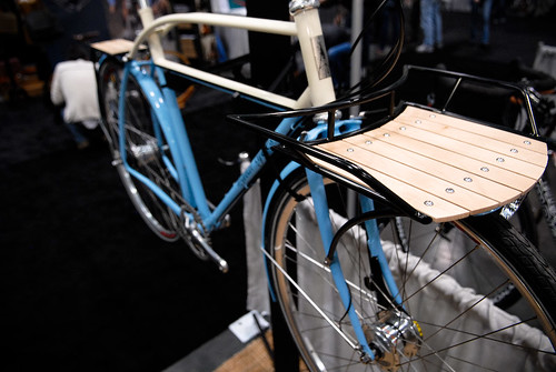
Next, from Signal Cycles, one of my favorite bikes from NAHBS 2008:
 Honestly, I'm not so keen on the front rack, although I understand why lot of folks like it. I just don't think it goes with the aesthetic of the rest of the bike. It ought to be chromed or stainless steel, for one, and it should have a contempo-paperboy feel, a little Waldish, if you know what I'm talkin' about.
Woah, did you see that? A new Wald website, using ColdFusion no less - straight from the 19th century to the 21st. It looks like they have some new product in there too: Mesh Baskets (the 933 and the 957) and black powder coated fenders.
 They clearly got the message: Bikes are cool, and we're taking over. They also have a new logo and shirt design. I was bummed that they dumped the old one until I read the fine print: CRICKET PRESS did their design work. I love it when relationships triangulate, it suggests that everything will be OK, which is comforting.
I still think the shirt is a little cheesy, with the "What will you put in your basket?" bit, but I'll let it slide.
 Here's a nice shot of what happens when you use bike parts for off-label uses. I think it kinda serves 'em right for calling their company "Kooka," don't you think?
And of course, we need a little communist death-metal fixed gear action to get through the week.
Now, in case you haven't been paying attention, this years hot styling is longitudinal two-tone paint-schemes, with or with out striping. In evidence: Spot Brand's entire line of pause for a moment,
I thought it would be 2050 before I got to say that phrase. Someone pinch me.
Next, from Signal Cycles, one of my favorite bikes from NAHBS 2008:
 Honestly, I'm not so keen on the front rack, although I understand why lot of folks like it. I just don't think it goes with the aesthetic of the rest of the bike. It ought to be chromed or stainless steel, for one, and it should have a contempo-paperboy feel, a little Waldish, if you know what I'm talkin' about.
Woah, did you see that? A new Wald website, using ColdFusion no less - straight from the 19th century to the 21st. It looks like they have some new product in there too: Mesh Baskets (the 933 and the 957) and black powder coated fenders.
 They clearly got the message: Bikes are cool, and we're taking over. They also have a new logo and shirt design. I was bummed that they dumped the old one until I read the fine print: CRICKET PRESS did their design work. I love it when relationships triangulate, it suggests that everything will be OK, which is comforting.
I still think the shirt is a little cheesy, with the "What will you put in your basket?" bit, but I'll let it slide.


No comments:
Post a Comment